In this article I will share the steps to hide or disable the hamburger menu in the menu module in the Divi theme.
By default the menu will turn into a dropdown mobile menu with the hamburger icon. The hamburger icon when clicked will open the dropdown and show the menu items.
The menu module turns into the hamburger menu on Tablets and Phones by default. Which means under 980px you will see the dropdown mobile menu instead of the regular menu items that you see on desktops.
If you want to show the desktop menu even on smaller screens then we can accomplish this with a short piece of css code.
Add CSS Class to Disable Hamburger Menu in Menu Module
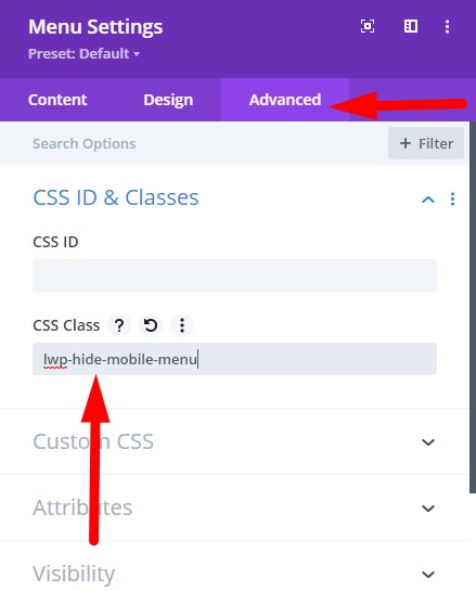
The first step is to add a CSS Class to the menu module so we can target this specific menu module and not affect any other menu modules on the website.
Please open the Menu Module Settings > Advanced > CSS ID & Classes and then add the CSS Class lwp-hide-mobile-menu to it.
If you are not sure where to add the CSS Class then here is a screenshot to help you.
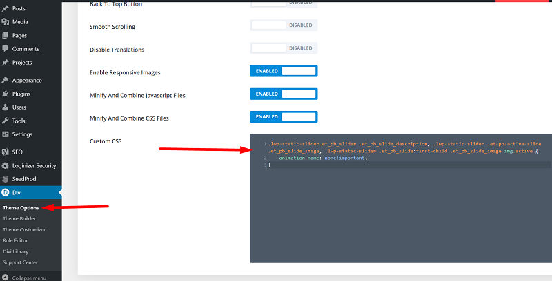
Add CSS Code to Hide Hamburger Menu in Theme Options
Next go to your Dashboard > Divi > Theme Options > Custom CSS and add the below code in it. This will disable the hamburger menu on both tablets and phones and show the default desktop menu.
.lwp-hide-mobile-menu.et_pb_menu .et_pb_menu__menu,.lwp-hide-mobile-menu.et_pb_fullwidth_menu .et_pb_menu__menu {
    display: flex!important;
}

.lwp-hide-mobile-menu .et_mobile_nav_menu {
    display: none;
}
Please check the screenshot below to understand where to add the code.
If you want to disable the hamburger menu only on tablets then you can use the code below. In this code we are only targeting the tablet resolution so phones will show the hamburger menu.
@media (min-width: 768px) and (max-width: 980px) {
    .lwp-hide-mobile-menu.et_pb_menu .et_pb_menu__menu,.lwp-hide-mobile-menu.et_pb_fullwidth_menu .et_pb_menu__menu {
        display: flex!important;
    }

    .lwp-hide-mobile-menu .et_mobile_nav_menu {
        display: none;
    }
}
CSS Code for Vertical Menu Module
By default the menu items will show side by side when you disable the hamburger menu, like the menu on Desktops.
If you want to show only one menu item per line then you can use the below code. You have to add this code after the code that you added above.
.lwp-hide-mobile-menu .et_pb_menu__menu > nav > ul > li {
    width:100%
}
If you want this code to only affect Phones then you can try this code instead.
@media (max-width: 767px) {
    .lwp-hide-mobile-menu .et_pb_menu__menu > nav > ul > li {
        width:100%
    }
}
That’s it, the end of the article. Next you can read one of the following Divi related tutorials.
- How to Show Title on Hover in Divi Portfolio Module
- How to Display a Different Logo on Mobile in Divi
Don’t forget to subscribe to the Newsletter to receive the latest tutorials in your inbox. Leave a comment below if you found this helpful or have any questions related to this tutorial.
Awesome that worked.
Thank you so much for this!
Great Tutorial. Thanks for posting.
Thank you, very useful for my footer menu!!
I’m surprised that even today this module doesn’t have an option to configure this behavior in an easier way. Unbelievable.