In this article I will share the code and steps to replicate the 3 hover effects from the Divi Blog article written in 2017 but for the menu module.
The original article from the Divi Blog is 3 Beautiful CSS Hover Effects You Can Add to Your Divi Menus. However it only contains the codes for the default header. This article contains the codes for the menu module.
If you are looking to apply these hover effects to the default header then please check the original article from Divi Blog.
Adding Custom CSS Class to Menu Module
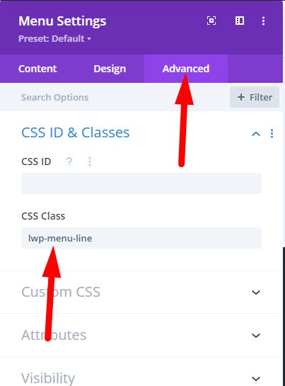
To make the codes work you have to add a CSS Class in to the menu module. You have to add the CSS Class at Menu Module Settings > Advanced > CSS ID & Classes > CSS Class.
For each style we will use a different CSS class. This is so that you can add different styles for different menu modules on the same website. If all of them use the same custom css class then that would not be possible.
At the start of each style I will mention the CSS Class that you need to enter in the Menu Module settings.
If you are not sure where to add the CSS Class then here is a screenshot to help you.
Style One – Growing Line Underneath
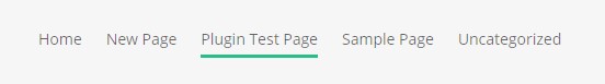
To add the growing line underneath style to your menu module please add the CSS Class lwp-menu-line to the menu module settings.
Then go to your WordPress Dashboard > Divi > Theme Options > Custom CSS and add the following code in it.
.lwp-menu-line .current-menu-item a::before, .lwp-menu-line .current_page_item a::before {
    content: "";
    position: absolute;
    z-index: 2;
    left: 0;
    right: 0;
    bottom: 0;
}

.lwp-menu-line li a:before {
    content: "";
    position: absolute;
    z-index: 1;
    left: 0;
    right: 100%;
    bottom: 0;
    background: #15bf86;
    height: 3px;
    -webkit-transition-property: right;
    transition-property: right;
    -webkit-transition-duration: 0.3s;
    transition-duration: 0.3s;
    -webkit-transition-timing-function: ease-out;
    transition-timing-function: ease-out;
}

.lwp-menu-line li a:hover {
    opacity: 1 !important;
}

.lwp-menu-line li a:hover:before {
    right: 0;
}

.lwp-menu-line li li a:before {
    bottom: 0;
}

.lwp-menu-line .et_pb_menu__menu > nav > ul > li > a {
    padding-bottom: 10px;
}
That is it. You should now see an underline grow under the menu item when you hover over it.
Style Two – Thick “boxy” look with line underneath
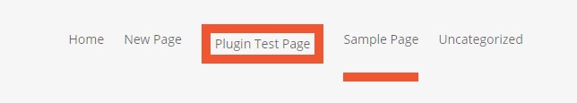
Please add the CSS Class lwp-menu-box to the menu module. This effect will add a thick box to the active menu item and a line underneath on the rest of the menu items on hover.
After adding the CSS Class to the menu module go to your WordPress Dashboard > Divi > Theme Options > Custom CSS and add the below css code there.
.lwp-menu-box li > a:hover {
    box-shadow: 0 10px 0 0 #F15A29 !important;
    padding-bottom: 34px;
    opacity: 1 !important;
}

.lwp-menu-box li li a {
    padding-bottom: 0px !important;
}

/*CSS to add border on active menu item. Remove the below code if you only want the underline effect*/
.lwp-menu-box li.current-menu-item > a, .lwp-menu-box li.current_page_item > a {
    border: 10px solid #F15A29;
    transform: translateY(-10px);
    padding: 5px!important
}
Style Three – Background colored buttons
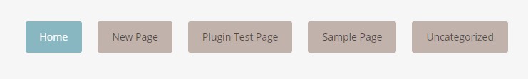
To turn all the menu items in to buttons please add the CSS Class lwp-menu-buttons to the menu module. If you are not sure where to add the code then please scroll to the top of the page. You will find the instructions there.
After adding the CSS Class to the module go to your WordPress Dashboard > Divi > Theme Options > Custom CSS and add the following custom css code there.
.lwp-menu-buttons li {
    padding-right: 5px;
}

/*** CHANGES THE BACKGROUND COLOR ***/
.lwp-menu-buttons li a {
    background: #C1B2AB;
    padding: 15px 20px;
    border-radius: 3px;
}

.lwp-menu-buttons li a:hover, .lwp-menu-buttons li li a:hover {
    color: #fff !important;
}

/*** CHANGES THE BACKGROUND COLOR ON HOVER ***/
.lwp-menu-buttons li a:hover {
    background: #559CAD !important;
}

/*** CHANGES THE BACKGROUND COLOR OF THE CURRENT PAGE LINK ***/
.lwp-menu-buttons li.current-menu-item > a {
    background: #edc77b;
}

.lwp-menu-buttons .menu-item-has-children > a:first-child:after {
    content: none;
}

.lwp-menu-buttons .et_pb_menu__menu > nav > ul > li > a {
    padding: 15px 20px!important;
}
Those are all the CSS codes from the Elegant Themes blog now modified to work for the menu modules in Divi.
You might also like to learn How to Add Icons to the Divi Menu.
Leave a comment below if you found this helpful or have any questions. Don’t forget to subscribe to the Newsletter to receive the latest tutorials in your inbox.
0 Comments