In this short tutorial I will share the steps to show buttons side by side in the Divi theme.
There is no way to show two buttons modules on the same line inside a column in the Divi theme by default. But it is possible to achieve this with a bit of custom css code.
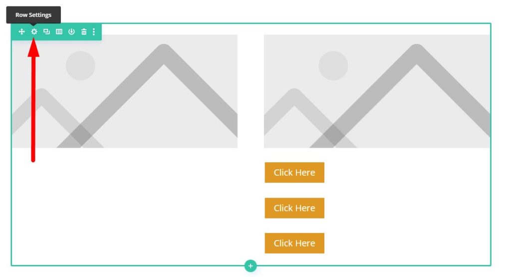
Here is a preview of how it will look like. As you can see the 3 buttons in the second columns display inline.

Add CSS Class In Column To Place Buttons Side By Side
The first step is to add a CSS Class to the Column. First open the Row Settings which has the buttons.
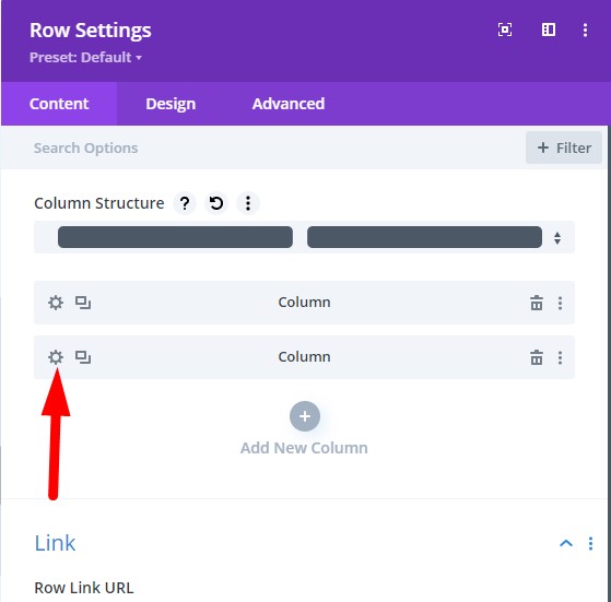
Then open the Column Settings for the column that contains the buttons that you want to show side by side. In my case the buttons are inside the second column. So I will open the setting for the second column.
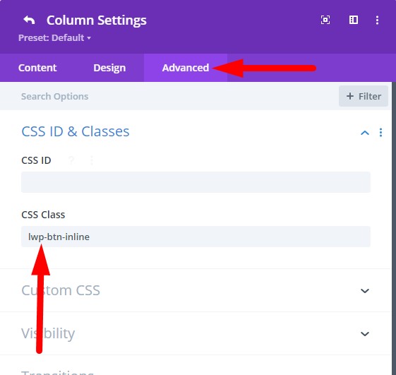
Then go to Advanced > CSS > CSS Class and enter the class lwp-btn-inline. After adding the class to the column save the page.
Add Custom CSS Code To Display Buttons Inline
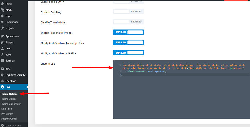
Now go to your WordPress Dashboard > Divi > Theme Options > General > Custom CSS and then add the following code.
.lwp-btn-inline .et_pb_button_module_wrapper {
    display: inline-block;
    margin-left: 10px;
}
If you are not sure where to add the code then here is a screenshot to help you.
That’s it, the buttons in the column will appear next to each other.
If you only want to show buttons on the same line on Desktops then you can wrap the code in a media query.
@media only screen and (min-width: 981px) {
    .lwp-btn-inline .et_pb_button_module_wrapper {
        display: inline-block;
        margin-left: 10px;
    }
}
The 981px value means that the buttons will be placed next to each other on Desktops only. If you also want to show buttons inline on Tablets then you can change the 981px value to 768px.
@media only screen and (min-width: 768px) {
    .lwp-btn-inline .et_pb_button_module_wrapper {
        display: inline-block;
        margin-left: 10px;
    }
}
If you would like to learn more about the Divi breakpoints then you can check this detailed article on the Elegant Themes Blog How to Identify Divi’s Responsive Breakpoints and Fine Tune Your Designs with Media Queries.
Here are some other Divi tutorials you might want to checkout
- How to add a Call To Action Button to Divi Menu
- How to Autoplay Videos in Divi Video Module And Hide Controls
- Remove Download Option from Video in Divi Video Module
Leave a comment below if you have any questions. Don’t forget to subscribe to the Newsletter to receive the latest tutorials in your inbox.
Thank you for this great Tutorial. The solution for mobile devices is great.