In this article I will share the steps to keep the desktop menu on mobile. And disable the mobile menu or the hamburger menu in the default Divi theme header area.
The code in this article will only work for hamburger menu in the default header of Divi theme. If you are using the menu module then please check the article Disable Mobile Menu in Menu Module.
When you open your website on a tablet or phone then the Divi menu will turn in to a hamburger menu. The breakpoint for tablets is 980px in the Divi theme. Which means that the menu will turn on to a drop down menu on any screen with a resolution less than 980px.
In some cases you would want to keep the default menu as it is without turning it in to a drop down menu. This can be useful if there only a few menu items in the header and can easily fit on smaller screens.
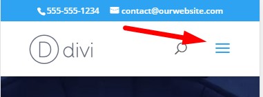
To clarify here is a screenshot of the hamburger menu in Divi. We are going to replace this drop down menu with regular menu items in its place.
Hiding the hamburger menu in the default Divi theme header is really simple.
Add CSS Code to Hide Hamburger Menu in Theme Options
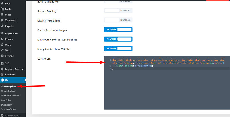
Go to your Dashboard > Divi > Theme Options > Custom CSS and add the below code in it.
@media (max-width: 980px) {
    #et_mobile_nav_menu {
        display: none;
    }

    #top-menu {
        display: block;
    }
}
This will hide the hamburger menu and show your desktop menu at its place.
If you are not sure where to add the css code then here is a screenshot to help you.
If you only want to disable the hamburger menu on tablets then you can use this code instead.
@media (min-width: 768px) and (max-width: 980px) {
    #et_mobile_nav_menu {
        display: none;
    }

    #top-menu {
        display: block;
    }
}
This code will show the hamburger menu on phones but disable it for tablets.
Here are some other Divi tutorials that you can read next.
- How To Change Number of Columns in Divi Mega Menu
- How To Add Buttons Side By Side In Divi Theme
- Remove Download Option from Video in Divi Video Module
Leave a comment below if you have any questions. Don’t forget to subscribe to the Newsletter to receive the latest tutorials in your inbox.
this didnt work for me. is there a way to directly contact you for help?