In this short tutorial I will show you how to turn the centered header in the Divi theme to the default header, the left aligned header on mobile phones and tablets.
If you are trying to switch your default header in to a centered header on phones then please checkout my previous tutorial Turn Divi Default Header Into Centered Header On Mobile
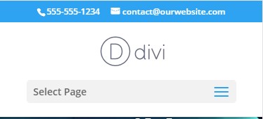
The centered header has the logo in the center and the menu right under it. The centered header looks like the following screenshot.
While the default header has the logo on the left and the menu icon on the right. It looks like the screenshot below.

In this tutorial we will be turning the first image into the second image.
Add jQuery Code to Theme Options
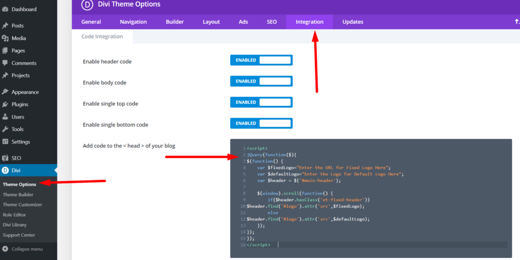
Please add the following piece of code at your WordPress Dashboard > Theme Options > Integration > Add code to the < head > of your blog
<script>
jQuery(function ($) {
    $(document).ready(function () {
        if ($(window).width() < 981) {
            $('body').removeClass('et_header_style_centered');
            $('body').removeClass('et_header_style_split');
            $('body').addClass('et_header_style_left');
        }
    });
});
</script>
That’s it you are done. Adding the code to the theme options will change the centered header in to the default header on mobile phones and tablets.
If you are having trouble finding the place to enter the code then here is a screenshot to help you.
If you want the code to only affect mobile phones and want to keep the centered style on tablets then you just need to change one number inside the code.
You need to change the 981 value in this line of code if ($(window).width() < 981) and change it to 481. Changing the 981 value to 481 will make it so that the left aligned header is only displayed on devices that have a resolution width of 480px or lower.
With the change the new code will be
<script>
jQuery(function ($) {
    $(document).ready(function () {
        if ($(window).width() < 481) {
            $('body').removeClass('et_header_style_centered');
            $('body').removeClass('et_header_style_split');
            $('body').addClass('et_header_style_left');
        }
    });
});
</script>
If you are trying to change the centered header to left header for the menu module then these codes will not work. I am going to write a tutorial for them soon.
If are you looking to do the opposite Turning Divi Default Header Into Centered Header On Mobile then I already have an article to help you.
Leave a comment below if you found this helpful or have any questions. Don’t forget to subscribe to the Newsletter to receive the latest tutorials in your inbox.
0 Comments